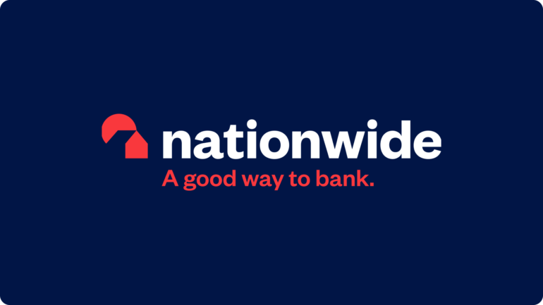
Following its rebrand last week, brokers have shared their views on the new Nationwide logo and strapline. Overall, it’s fair to say, they weren’t impressed.
Justin Moy, managing director at EHF Mortgages, said: “At first glance, it has a resemblance to NatWest’s logo. Perhaps we should call them NatWide in future?” Stephen Perkins, managing director at Yellow Brick Mortgages, agreed: “Aside from looking awfully like NatWest, the tag line of a good way to bank for a mutual that has said for years that they aren’t a bank is crazy. Like the new logo, it looks like the sun is setting on NatWest, sorry, I mean Nationwide.”
Lewis Shaw, owner at Mansfield-based Shaw Financial Services, was withering: “No. Just no. This is not the one. Not to mention the font on the website. It’s awful. At least someone made a few quid though so every cloud…”
Meanwhile, Bob Singh, founder at Chess Mortgages, took irony to a new level, and wondered if the building society could be set to become a bank: “I love it. It’s new and fresh and a great way to spend shareholders’ funds in a cost-of-living crisis. I hope all existing stationery is used up before using the new logo otherwise it’s not very green. The house should have been outlined in red so it doesn’t look like Pac-Man. Using the word bank when they are a building society is perhaps not a good idea (it’s a play on words I know), but could this be a sign of an impending stock market flotation?”
Katy Eatenton, mortgage and protection specialist at Lifetime Wealth Management, questioned the use of the word ‘good’: “Good isn’t a mind-blowing adjective to start with. That, paired with the fact that Nationwide is a building society, not a bank, makes everything about this rebrand wrong.”
Simon Bridgland, director at Release Freedom was also slightly baffled: “For a business that operates as a society and that spends squillions of pounds on marketing and advertising that, what was the reason at head office for specifically using the word ‘bank’ in the strap line?”
Steven Morris, advising director at Advantage Financial Solutions, described the new logo as generic and, grammatical pedant that he is, was horrified by the lack of capitalisation: “Nationwide had previously nailed their branding with a friendly, soft, recognisable logo to match the values of the UK’s biggest mutual. Why change? I appreciate logos are subjective and there is a bias to what you have always known, but this new logo is totally generic. Worse still, the first letter isn’t even capitalised. There must have been some serious emperor’s new clothes yes man-ing going on when this was initially presented for feedback internally at Nationwide.”